Claytone Font Review: Elevating Digital Brand Identity
I was recently deep in the wireframing phase for a boutique skincare client’s website redesign when I realized their current typography lacked the organic warmth their brand promised. The layout was clean, and the user flow was logical, but the hero section felt sterile. I needed a typeface that could bridge the gap between high-end editorial aesthetics and approachable, handmade authenticity. That is when I decided to test Claytone, a sophisticated script calligraphy font from Script Amp, directly in the browser environment. Rather than just admiring it in a static mockup, I wanted to see how this premium font performed when subjected to the realities of responsive web design, variable screen sizes, and actual user interaction.
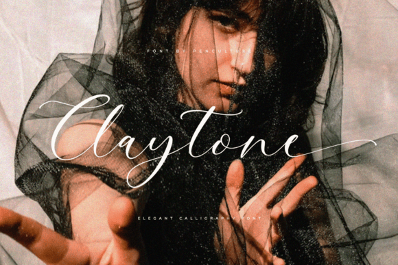
The first thing that struck me when implementing Claytone into the live staging site was its distinct visual personality. Unlike many digital script fonts that can feel overly rigid or artificially connected, Claytone possesses a natural rhythm that mimics genuine hand-lettering. The elegant tails and unique ligatures do not just sit on the baseline; they interact with the space around them. When placed over a muted, textured background image in the hero section, the font immediately established a mood of refined intimacy. It transformed a generic "Shop Now" header into an invitation. For web designers and digital product creators, this emotional resonance is critical. We are not just arranging pixels; we are crafting an atmosphere that encourages visitors to stay, trust, and eventually convert.
Performance in Hero Sections and Landing Pages
In my testing across various landing page layouts, Claytone proved to be an exceptional display font for primary headlines. I utilized it for the main value proposition on a course sales page, pairing it with a minimalist sans serif for the subhead. The contrast was immediate and effective. The script drew the eye to the core message while the supporting text remained highly legible for scanning. This hierarchy is essential for modern web design, where users often skim content before committing to reading. Claytone acts as a visual anchor, slowing the user down just enough to absorb the brand’s tone without creating friction.
However, using a creative font like Claytone in a digital environment requires intentional sizing and spacing. During the initial desktop preview, the ligatures looked exquisite at 4rem, but I noticed that tightening the tracking too much caused the elegant swashes to collide awkwardly. Giving the font room to breathe is non-negotiable. When I increased the line height and letter spacing slightly, the sophistication returned. This is a crucial consideration for UI designers: script fonts in web environments often need more negative space than their print counterparts to maintain their integrity. When given that space, Claytone elevates the perceived quality of the entire digital experience, making a standard WordPress or Shopify template feel bespoke and custom-designed.
Responsive Behavior and Mobile Readability
The true test of any web font is how it translates to mobile devices. A typeface that looks stunning on a 27-inch monitor can quickly become illegible clutter on a smartphone screen. I was pleasantly surprised by Claytone’s adaptability, provided it is used correctly. On mobile viewports, I found that scaling the font down proportionally sometimes made the thinner strokes disappear against complex backgrounds. The solution was not to abandon the font, but to adjust the application. Instead of using Claytone for long mobile headlines, I reserved it for short, impactful phrases or single-word accents.
- Avoid tiny sizes: Keep Claytone above 24px on mobile to preserve stroke clarity and ligature details.
- Contrast is key: Ensure high contrast between the script and the background; low-contrast overlays kill readability on small screens.
- Limit character count: Use the font for 3–5 words maximum per line on mobile to prevent awkward wrapping that breaks ligatures.
- Test on real devices: Browser emulators are helpful, but always check stroke rendering on actual iOS and Android screens.
For the skincare site, I ultimately used Claytone for the mobile navigation drawer title and special promotional banners rather than the main H1. This strategic restraint maintained the brand's elegance without sacrificing usability. It is a reminder that in responsive web design, a premium font is a tool for emphasis, not a blanket solution for all text elements.
Strategic Font Pairing for Digital Interfaces
Claytone shines brightest when it has a reliable partner. In web design, font pairing is about balancing personality with utility. Because Claytone is rich with decorative details and expressive curves, it demands a grounding counterpart. During the project, I paired it with a geometric sans serif for body copy, navigation menus, and button text. The clean lines of the sans serif provided a necessary visual rest, allowing Claytone to pop without overwhelming the interface. This combination created a cohesive brand identity that felt both artistic and professional.
I also experimented with pairing Claytone alongside a classic serif font for a blog header redesign. This combination leaned heavily into editorial design, evoking the feel of a high-end fashion magazine translated for the web. This approach worked beautifully for long-form content sites where storytelling is central. However, I would caution against pairing Claytone with other handwritten or highly decorative fonts. In a digital interface, competing scripts create visual noise that confuses users and degrades accessibility. Stick to one star player for display purposes and let your functional typography support it quietly. This discipline ensures that your design assets work harmoniously to guide the user journey rather than distract from it.
Practical Considerations for Web Implementation
Before integrating Claytone into a live client project or digital product, there are several technical and licensing factors to verify. As web designers, we must ensure that our creative choices are sustainable and legal. First, confirm that you have the appropriate commercial font license for web use. Desktop licenses rarely cover @font-face embedding, so checking the specific webfont terms from Script Amp is mandatory for any commercial website, online store, or digital template you sell.
Additionally, consider the file formats and loading performance. Modern webfonts should be served in WOFF2 format to minimize load times. While Claytone is visually lightweight in style, script fonts can sometimes have larger file sizes due to the complexity of the glyph sets and included alternates. I recommend subsetting the font if you are only using it for English headlines, removing unused characters to improve site speed. Also, explore the included alternates and swashes before finalizing your CSS. Many script fonts include contextual alternates that automatically adjust connections based on letter placement; enabling these OpenType features in your stylesheet can make the difference between a font that looks typed and one that looks hand-drawn.
Finally, be mindful of accessibility. While Claytone is beautiful, it should never be used for critical functional text like form labels, error messages, or dense paragraphs. Users with dyslexia or visual impairments may struggle with elaborate scripts. Reserve Claytone for decorative headings, logo text, and atmospheric accents where the primary information is also available in accessible plain text. By treating Claytone as a specialized element within a broader typographic system, you honor both the artistry of the typeface and the needs of your users. It is this balance of beauty and function that defines successful modern web design, turning a simple visit into a memorable brand experience.